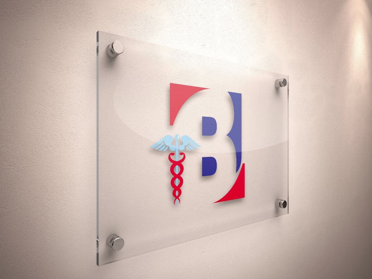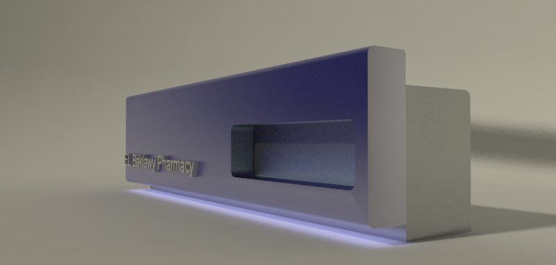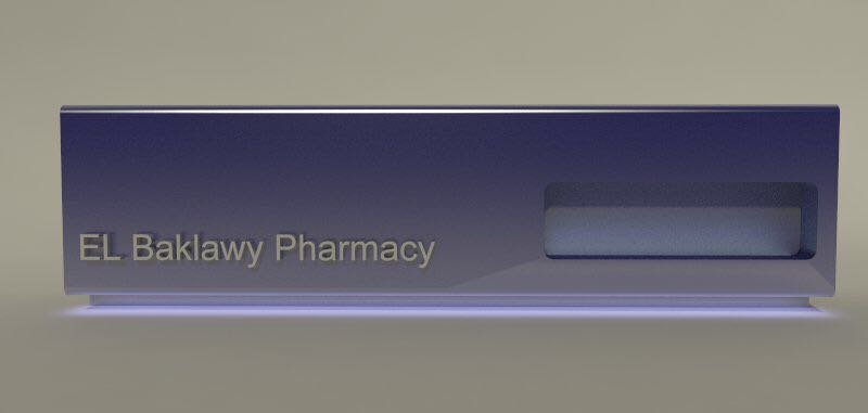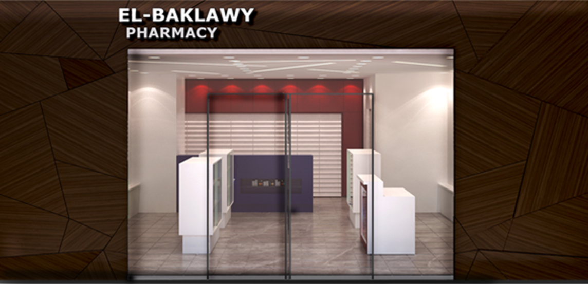
El BAKLAWY PHARMACY
“A trusted space, reshaped into a modern landmark of light, order, and belonging.”
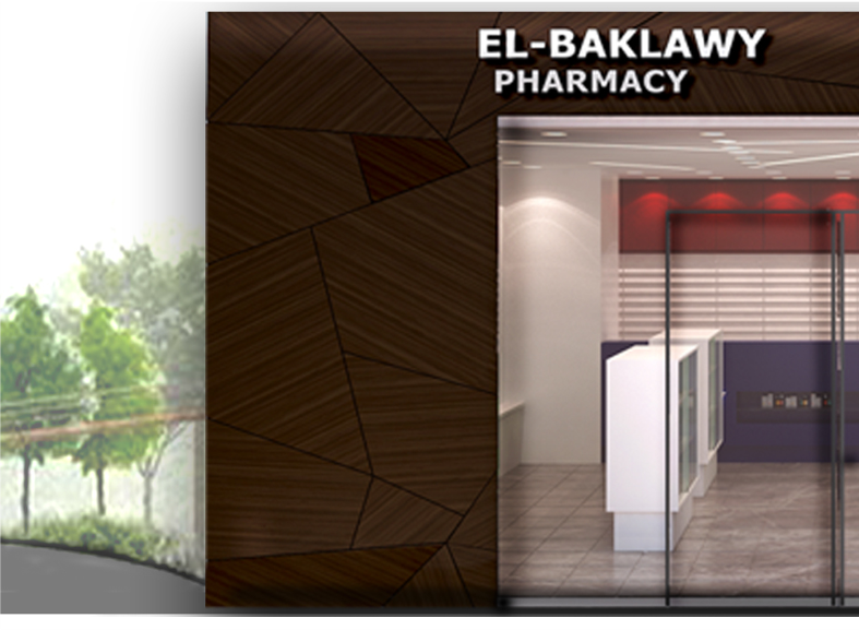
We reimagined El-Baklawy Pharmacy not only as a point of service, but as a moment of pause within the fast rhythm of an airport. In the flow of travel, it needed to be instantly recognisable — a place of clarity and calm.
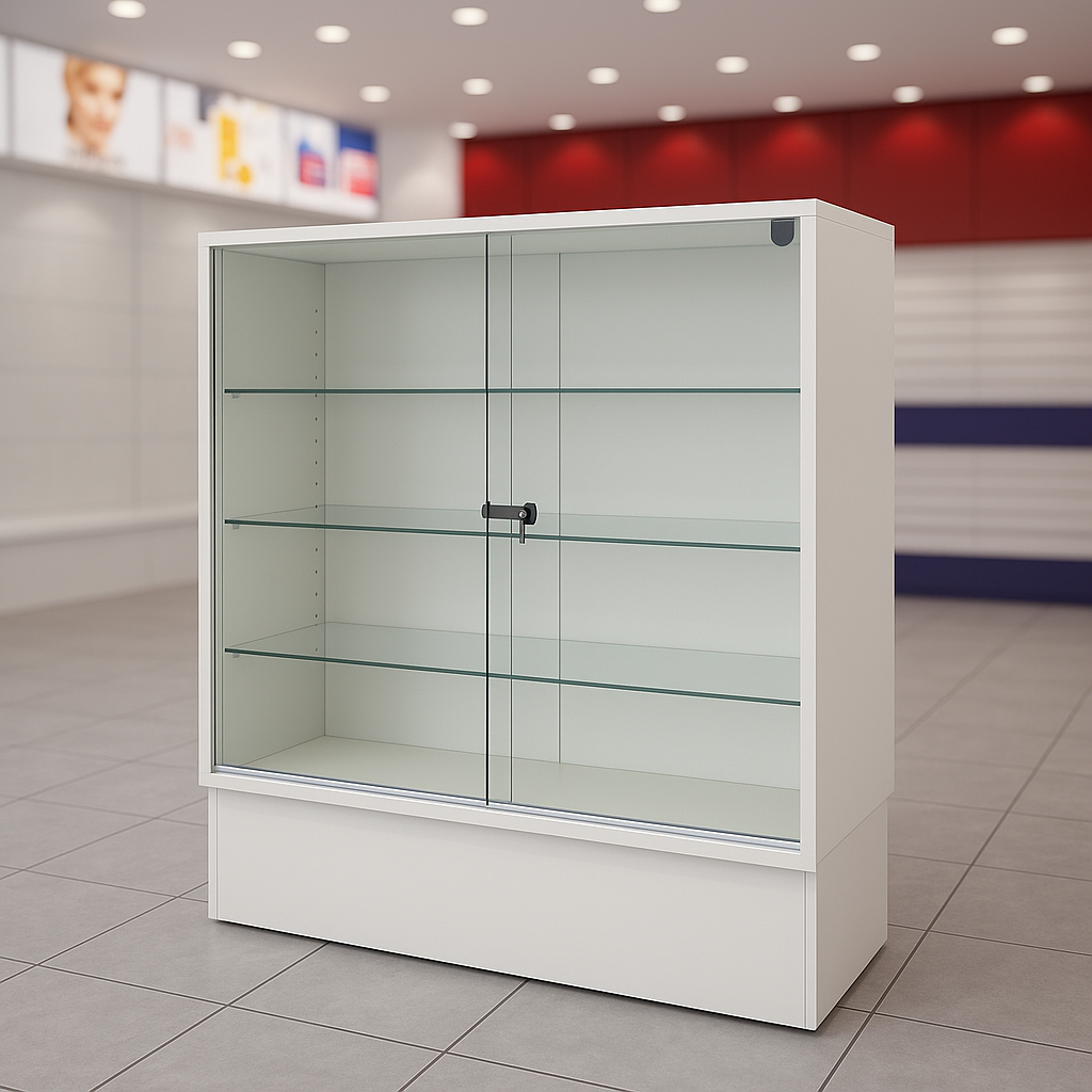
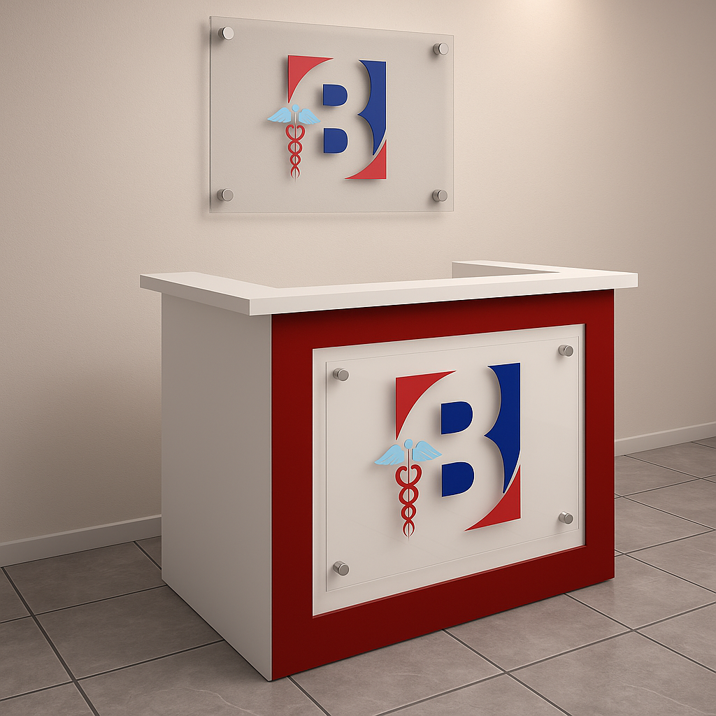
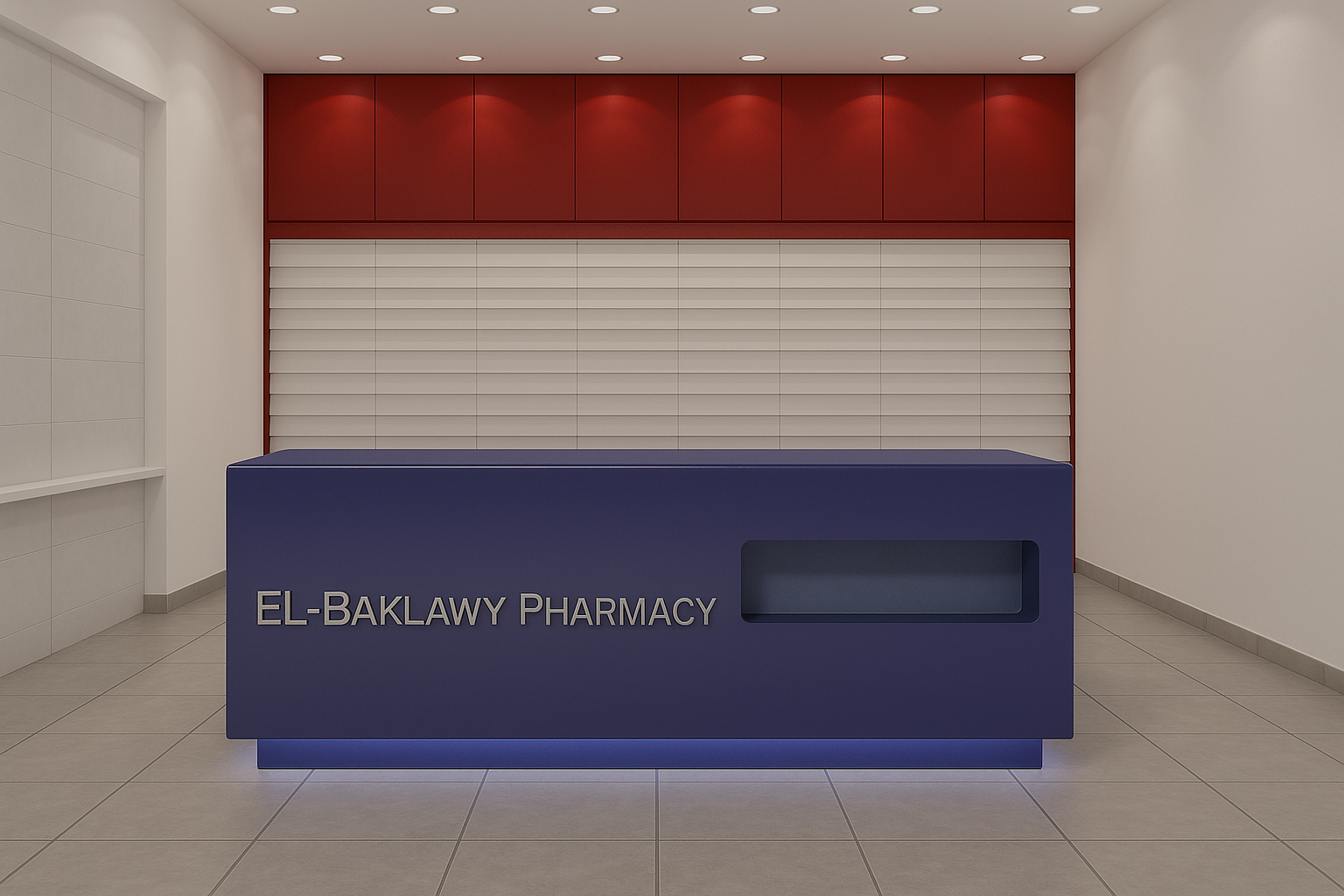
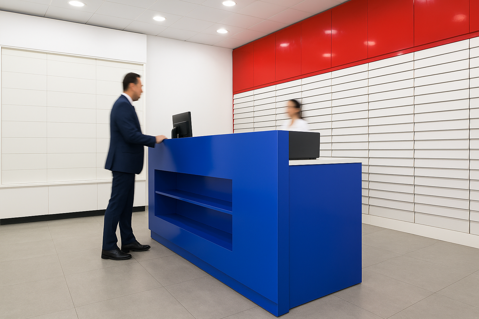
The design language drew from the pharmacy’s own colors — red, white, and deep blue — reinterpreted into clean architectural forms, glossy finishes, and luminous details. Each surface was shaped to guide the traveler intuitively, turning a familiar brand into a spatial landmark.
The design language drew from the pharmacy’s own colors — red, white, and deep blue — reinterpreted into clean architectural forms, glossy finishes, and luminous details. Each surface was shaped to guide the traveler intuitively, turning a familiar brand into a spatial landmark.

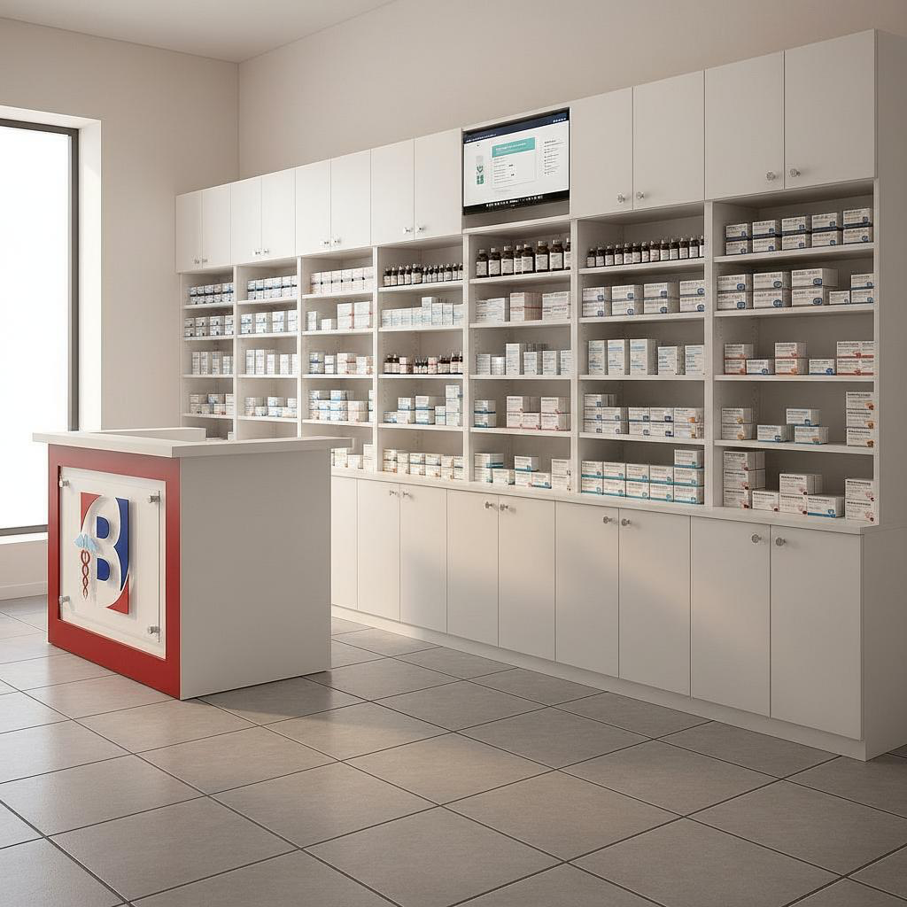
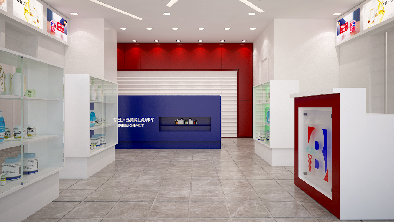
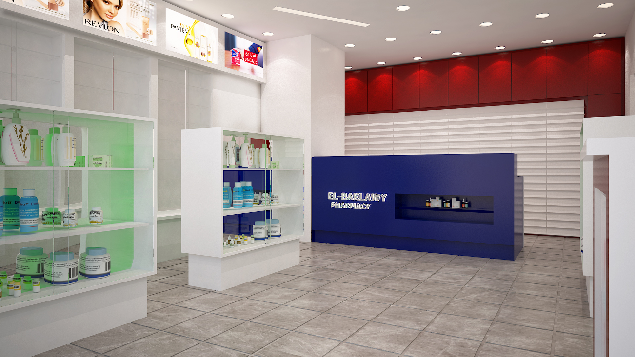
From design to execution, we carried this vision into every detail. The counters, shelving, and wall elements were crafted with precision, while a wood-textured façade introduced warmth against the neutrality of the airport’s architecture — a subtle gesture of familiarity amid transition.
The result is more than a pharmacy. It is a renewed identity: a space that communicates trust, efficiency, and belonging, while setting a scalable model for future branches of the brand.
The result is more than a pharmacy. It is a renewed identity: a space that communicates trust, efficiency, and belonging, while setting a scalable model for future branches of the brand.